|
Image Annotations |
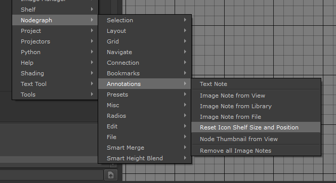
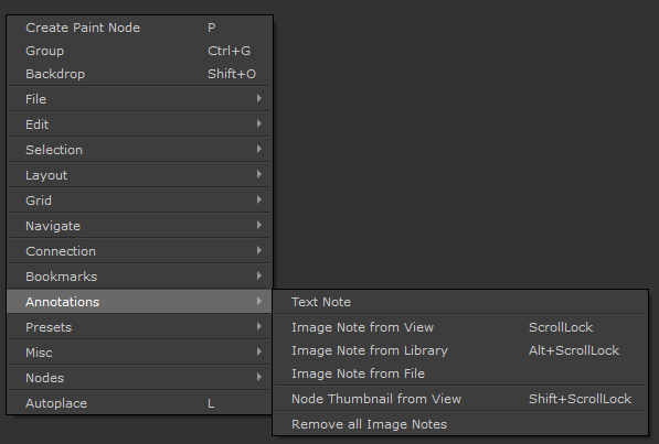
- Where to find it:
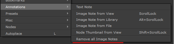
 NodeGraph / Right Mouse Click / Annotations /
- Main Window / Extension Pack / Nodegraph / Annotations /
- Shortcuts (Nodegraph Only):
- Image Note from View Scrolllock
- Image Note from Library ALT + Scrolllock
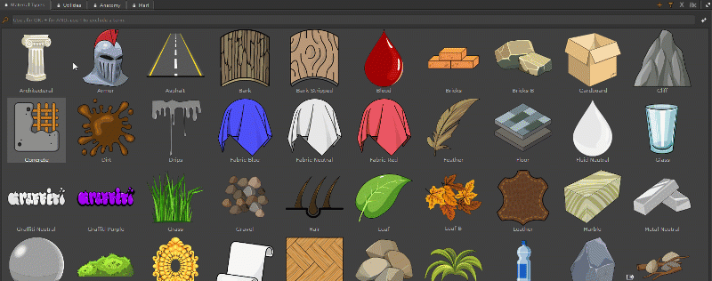
- Image Note from Node SHIFT + Scrolllock
- Video
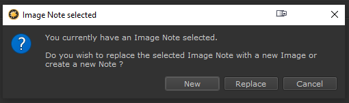
- Image Annotation Types
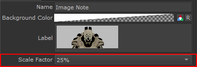
- Image Note Controls
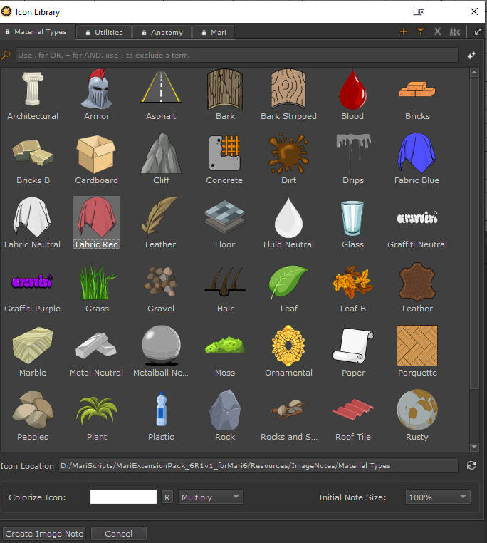
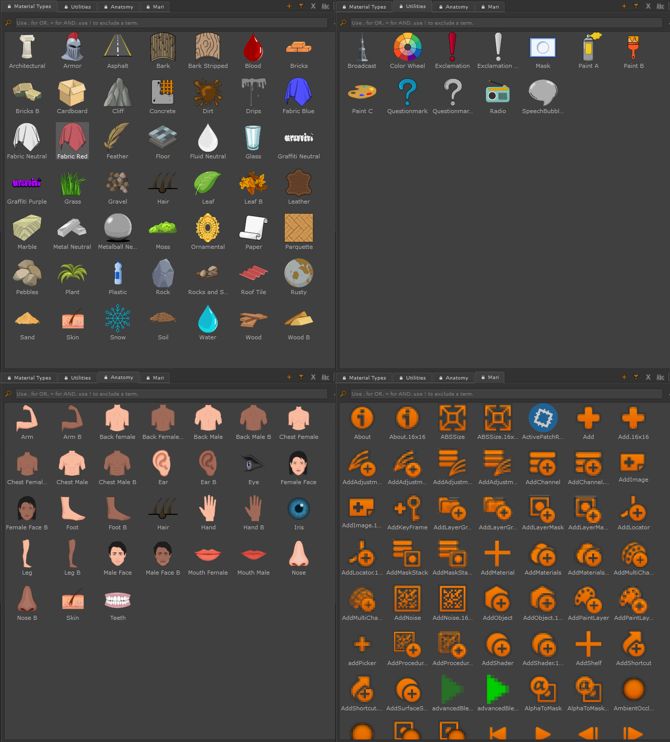
- Image Library Viewer
- Additional Image Library Options
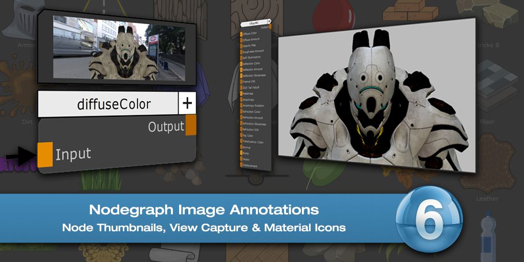
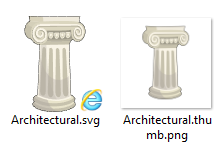
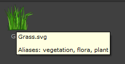
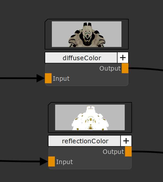
Image Annotations allow you to add screenshots, arbitrary images or Icons to your Nodegraph, to visually document different parts of your Nodegraph.
The System gives several different options to add images
|
|
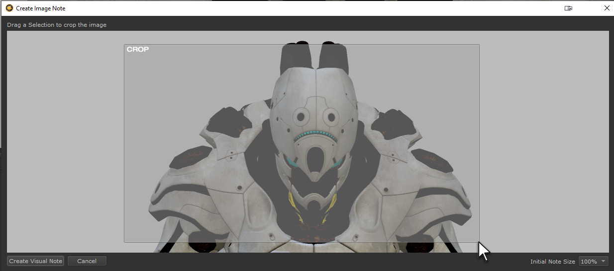
Image Notes are saved into your project directory in a Subfolder ImageNotes. They will be deleted from that location if you delete an image note from your project and save. Since files are saved in the project, handing an archive off to another artist wil retain the images |
|
Video |
See all the Image Annotation Features in Action here:
.. and a full tutorial here
|
Image Annotation Types |


